Fixing confusing navigation and UX debt in a robot vacuum app.
My role
Design concept and usability testing
Team
Marketing and fellow designers
Tools
Figma, UserTesting.com
Status
User tested. Not shipped.
The MyNeato app made a robot vacuum harder to use than it should be. Navigation was confusing and out of date, settings were split in ways users could not follow, and the design system had built up debt over time. I led a redesign concept and tested it with real users.
The problem
Users struggled to find the core actions. They needed to:
Start a cleaning
Check whether the last clean worked
Edit the floor plan
The business goal was clear: reduce confusion and pay down UX debt.
Research
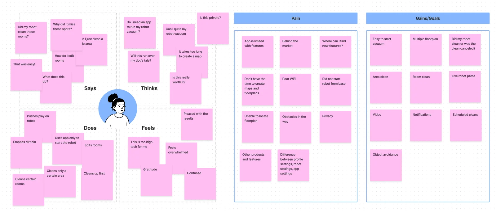
I rebuilt the personas with marketing input and in-home observation. Owners related to their robots in different ways:
Some named them and talked to them.
Some treated them like any other appliance.
Some watched closely while they ran.
Some only ran them when they were away.
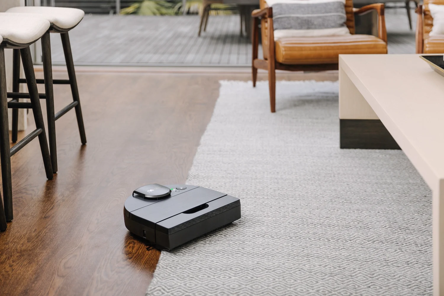
A robot vacuum in a living room.
Card sorting and context sessions with owners, non-owners, and coworkers showed a clear pattern: people mixed up profile settings, app settings, and robot settings.
Top user intents: start the vacuum, check whether the last clean succeeded, create no-go zones.
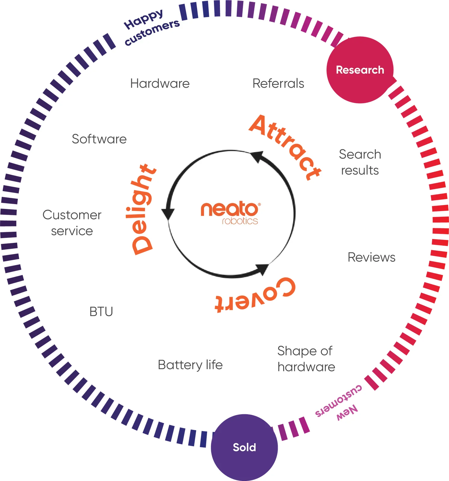
Empathy map from research: what owners say, think, do, and feel.The Neato customer journey.
Key decisions
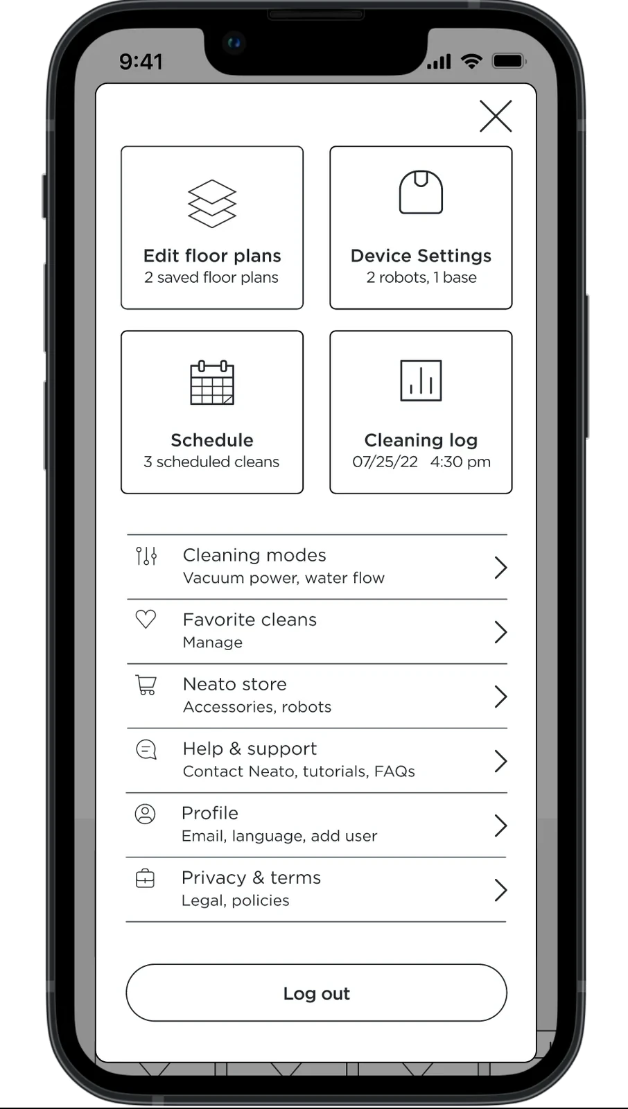
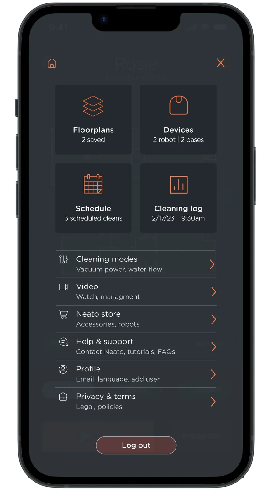
“Candy box” navigation
Decision A bento-style grid of clear tiles, one per task.
Options A tab bar, or a hamburger menu over the existing structure.
Why Card sorting showed users think in tasks, not in the app's old categories. Tiles put the top intents — start, check, no-go zones — one tap from home. Usability testing showed users found what they needed quickly.
Candy box menu: wireframe.Candy box menu: hi-fi, dark mode.
Settings split by owner
Decision Profile, app, and robot settings became clearly separate places.
Options Keep one combined settings tree.
Why Every research method showed people mixing the three up. The mental model came from users, not from the org chart.
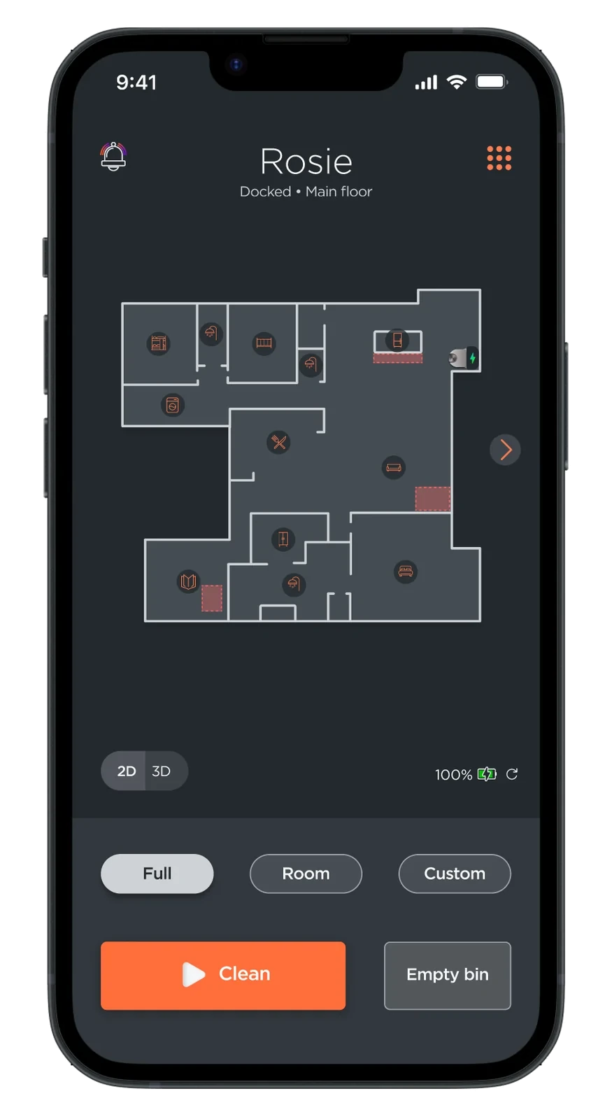
Dark mode from the existing style guide
Decision Adapted the current style guide into a dark mode design instead of a new visual language.
Options A full visual rebrand.
Why The debt was structural, not aesthetic. Reusing the guide kept the concept shippable and met accessibility standards for contrast and clarity.
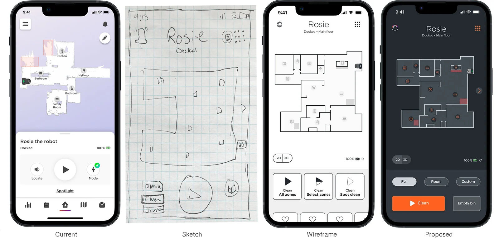
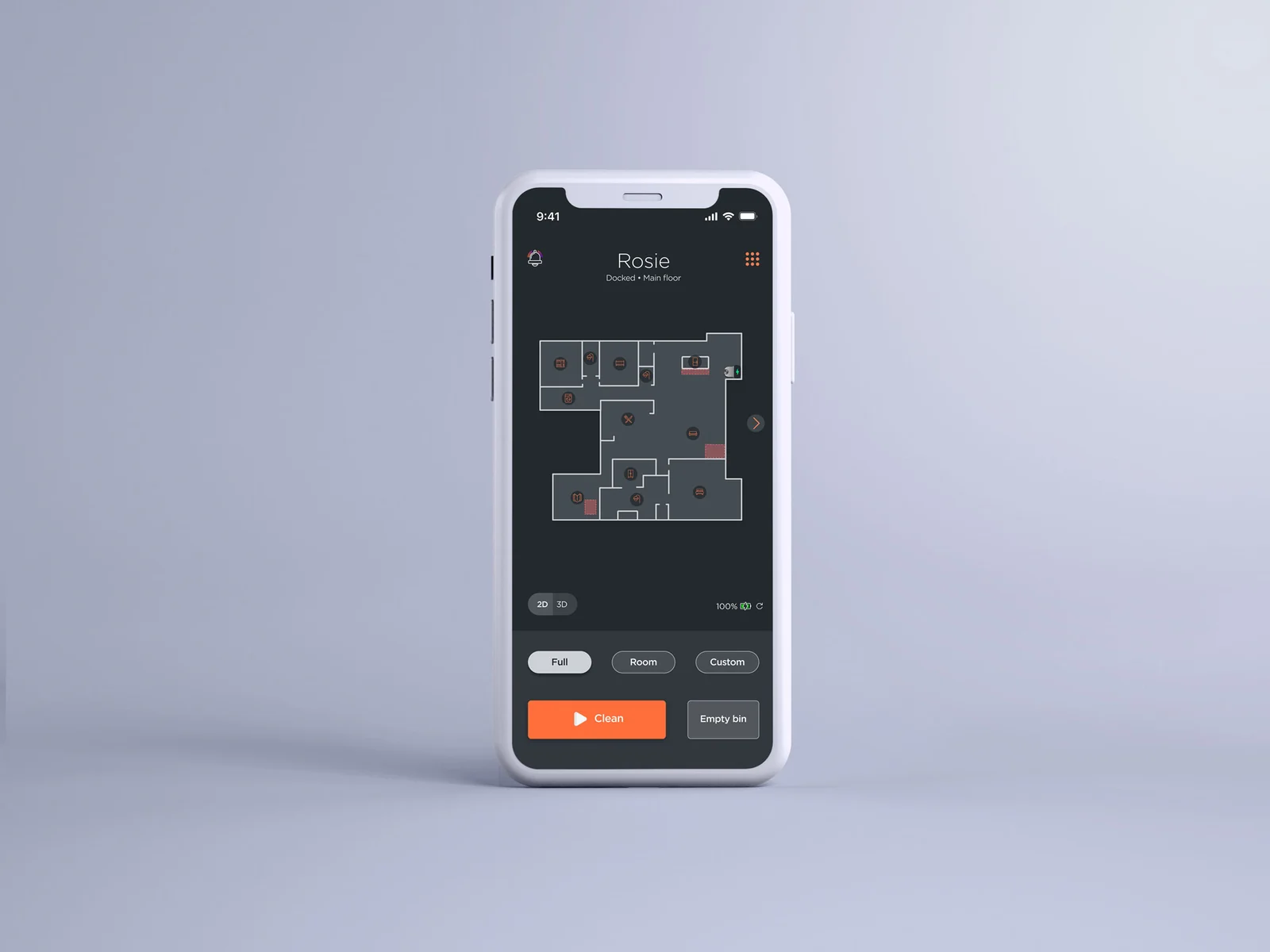
Dark mode home screen, hi-fi.From the current app, to a sketch, to a wireframe, to the proposed design.
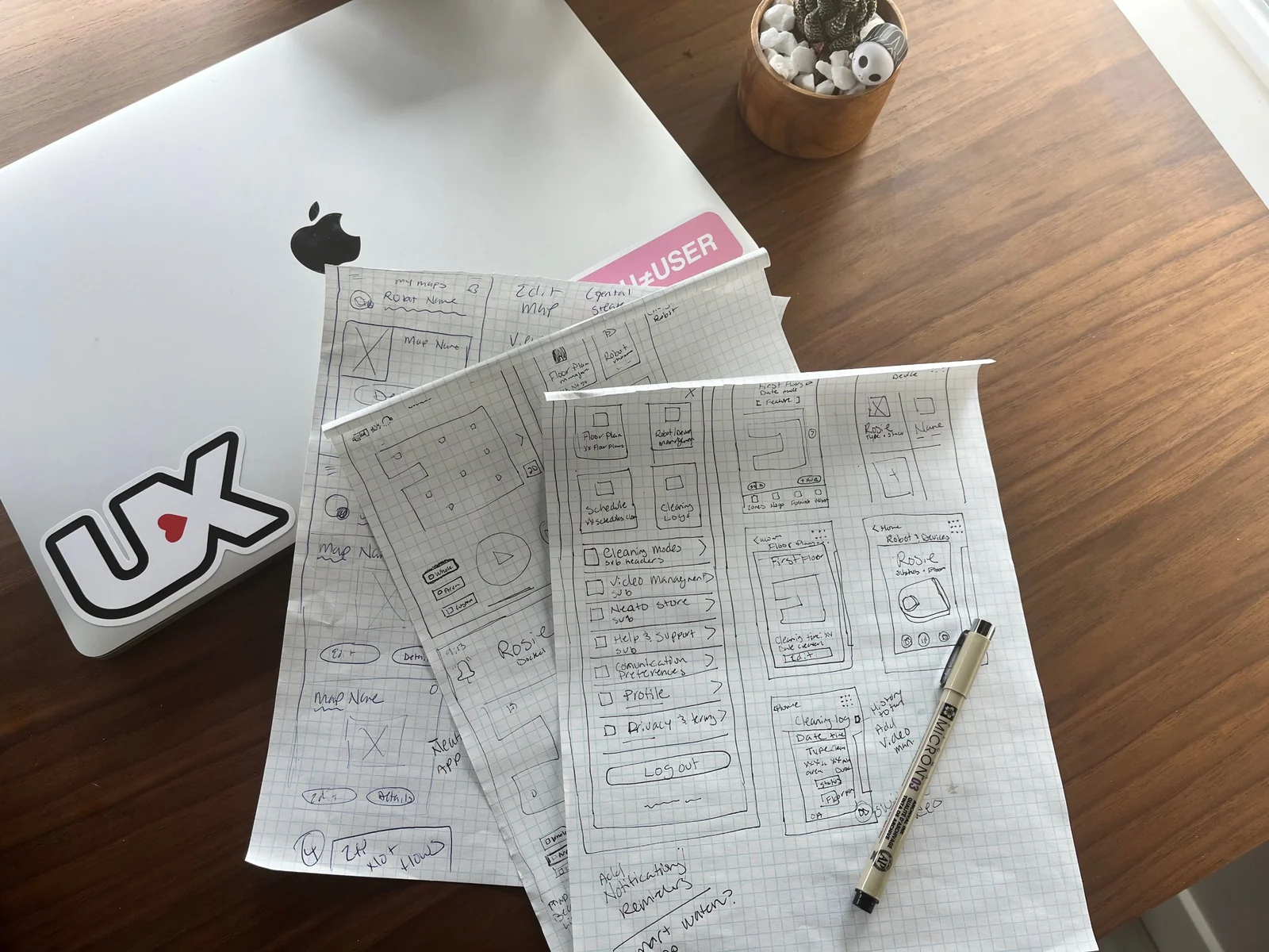
Sketches and wireframes
Early paper sketches.
Results
Usability testing showed users found what they needed quickly.
The concept was user tested but not shipped. The company's direction changed before the build.
The persona and navigation research still shaped roadmap conversations.